
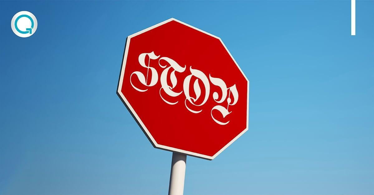
As you read this article, you may notice the typography which was carefully selected to reflect our brand throughout this text. On the other hand, you may not have, as typography is a more subtle part of branding that does not necessarily grab your immediate attention. However, when used consistently, typography, which is the arrangement of type and encompasses the typeface, font, and font family, reinforces your brand in the mind of the reader.
While typography may not be the first thing that springs to mind when you think about branding, when used effectively it has a positive impact on your audience, this is according to an MIT study that found that unappealing fonts reflect badly on the reader’s emotional response to content. Various print publications such as magazines, newspapers, and books understand the value of typography, each medium uses subtle differences to differentiate from other publications, but all select typography that will hold the reader’s attention and not distract from the content.
When compared to a logo and other visual elements of a brand, such as colour and imagery, typography may seem to be overlooked by the audience, but with the growth in digital transformation, customers are increasingly engaging with brands across various digital platforms and as such, typography needs to be a key component to all print and on-screen communications, from your letterheads to email correspondence.
Typography and your brand
Typography is important to your brand and forms part of its visual identity which is important for brand building and brand recall. This is supported by the picture superiority effect, which identifies that people recall the visual stimuli of your brand more than words. For this reason, when you see a billboard advert for a brand like Nando’s, without reading the text or seeing the logo, you would immediately recognise the brand that the font is associated with. In addition, if you saw the Nando’s font being used by a financial brand such as ABSA or Nedbank, you would question whether the brand was the right fit for you as the typography does not reflect the offering according to your expectations of a financial brand.
As such, typography, is an important component of branding and is believed to serve four purposes: distinction, consistency, coherence, and communication. This is because the right typography aligns with the brand purpose while enhancing the brand personality. When used consistently, customers come to recognise a brand from the font that they use in their advertising and communications.
Although digital platforms previously hampered the ability to use typography, the growth in digital transformation has driven the popularity of digital platforms as a preferred method of communication, as such more options are becoming available for brands to incorporate typography across platforms which means that brands can now use custom typography to distinguish from other brands in all correspondence.
Typography differentiates email correspondence
As email is a popular choice for customer correspondence, this method of communication should incorporate the company brand elements from the logo to the colour and even the typography, which should be standard across the entire organisation.
Standard fonts such as Times New Roman and Arial, have dominated email correspondence for many years thanks to their ability to be easy to read on low-resolution screens. However, as screen resolutions improve, companies are now spoilt for choice with a variety of attractive, standardised fonts that are viewed the same on the sender’s and recipient’s screens. While these fonts are typically best used in the body of an email, companies should use decorative typefaces for their logo[4], and if they have a custom font, it should be used in all email banners and signatures to reinforce the brand across all email correspondence.
Typography provides consistency across platforms
Although colour is highly regarded in branding and companies pay close attention to the Pantone used across branding materials and documents, typography provides consistency across all platforms where colour can fall short. For example, whether looking at typography on a screen or a sheet of paper, it remains consistent. Colour, on the other hand, may appear different on different screens and when printed out using different printers.
With this in mind, typography is more resilient than colour and as it is colour-agnostic, is an easily identified brand element even when used in black and white. As such all company documents and emails should incorporate a brand’s typography to enhance the brand and deliver a consistent experience across all customer communications.
With BrandMail, companies can use custom fonts within email signatures and banners to deliver consistent branding in every customer interaction. Further standardised fonts are managed centrally along with the brand standards to ensure that every email sent using BrandMail is consistently on brand every time.
Click here for more information about BrandMail.